10 UX/UI Mistakes That Are Quietly Killing Your Website's Conversions

Great design should feel invisible
A website can look impressive and still fail at its actual job.
If visitors get confused, distracted, or unsure what to do next, even the most polished design will lose leads.
That is the difference between good visuals and good UX/UI.
Strong UX/UI is not about trends. It is about removing friction so people can find what they need and take action.
Here are the most common UX/UI mistakes we see on small business websites, and how to fix them.
What is UX/UI, really?
UX (user experience) is how a website feels to use. UI (user interface) is how it looks and functions. Together, they determine whether a visitor understands your business quickly or gives up and leaves.
Good UX/UI answers three questions almost instantly: What is this business? What can I do here? Why should I trust it?
1. Unclear navigation
If visitors cannot find your services, pricing, or contact page within a few seconds, they will assume your business is hard to work with.
Navigation should be simple, predictable, and consistent across every page.
Use clear labels like “Services” instead of vague ones like “Solutions”
Keep your main menu to 5–7 items
Make your contact or booking option easy to find on every page
2. Weak visual hierarchy
Visual hierarchy tells visitors what to look at first, second, and third.
When every element competes for attention, headlines, buttons, and images, nothing stands out and visitors do not know where to focus.
Fix this with size, spacing, and contrast. Your headline should be the boldest thing on the page. Your call-to-action button should be impossible to miss.
3. Slow load times
Speed is part of UX, not a separate technical detail.
A visitor who waits more than a few seconds for your site to load has usually already left.
Compress images, remove unnecessary animations, and keep your homepage lightweight. A fast site feels more trustworthy before a single word is read.
4. Too many calls to action
When a page offers five different next steps, book a call, download a guide, follow on social, join a newsletter, buy now, visitors freeze.
A confused visitor rarely takes action.
Every page should have one primary call to action. Everything else should be secondary, smaller, and out of the way.
5. Designing for desktop only
Most small business websites now receive the majority of their traffic from mobile devices.
If your buttons are hard to tap, your text is too small, or your layout breaks on a phone, you are losing leads before they ever reach your offer.
Mobile experience should be treated as the primary design, not an afterthought.
How to know if your website has a UX/UI problem
You may have a UX/UI issue if visitors leave quickly, your bounce rate is high, people say your site is “confusing” or “hard to navigate,” or your inquiries do not match your traffic.
These are not always design problems. Often, they are experience problems.
The takeaway
A beautiful website that is hard to use will still lose you leads.
Strong UX/UI does not need to be flashy. It needs to be clear, fast, and easy to follow.
Not sure where your website is losing people? Download our free Website Growth Checklist to review your key pages, messaging, and conversion points before your next update.
————
FAQs
What is the difference between UX and UI?
UX (user experience) is how a website feels to use, including navigation and flow. UI (user interface) is the visual design, including layout, color, and typography. Both work together to shape how visitors perceive and use your site.
How do I know if my website has bad UX?
Common signs include high bounce rates, visitors leaving quickly, confusion about navigation, and low conversion despite steady traffic. User behavior data and visitor feedback are the fastest ways to confirm the issue.
Does improving UX/UI actually increase leads?
Yes. Clearer navigation, stronger visual hierarchy, and simplified calls to action make it easier for visitors to understand your offer and take the next step, which directly improves conversion.
Is mobile UX really that important?
Yes. Most small business websites receive the majority of their traffic from mobile devices, so a site that is hard to use on a phone will lose leads regardless of how it looks on desktop.
Does ANG Productions help with UX/UI improvements?
Yes. ANG Productions helps businesses improve website structure, user flow, and design so visitors can navigate easily, trust the brand, and take action.
Related Articles
Read more from our blog

What a Website Strategist Actually Does for Your Business
Wix vs. Squarespace vs. Framer vs. Shopify: Which Platform Is Right for Your Small Business in 2026?
How Much Does a Small Business Website Cost in 2026? (An Honest Breakdown)
How to Plan a Website That Grows With Your Business
What Your Website Should Actually Be Doing for You
Stop Treating Your Website Like a Project
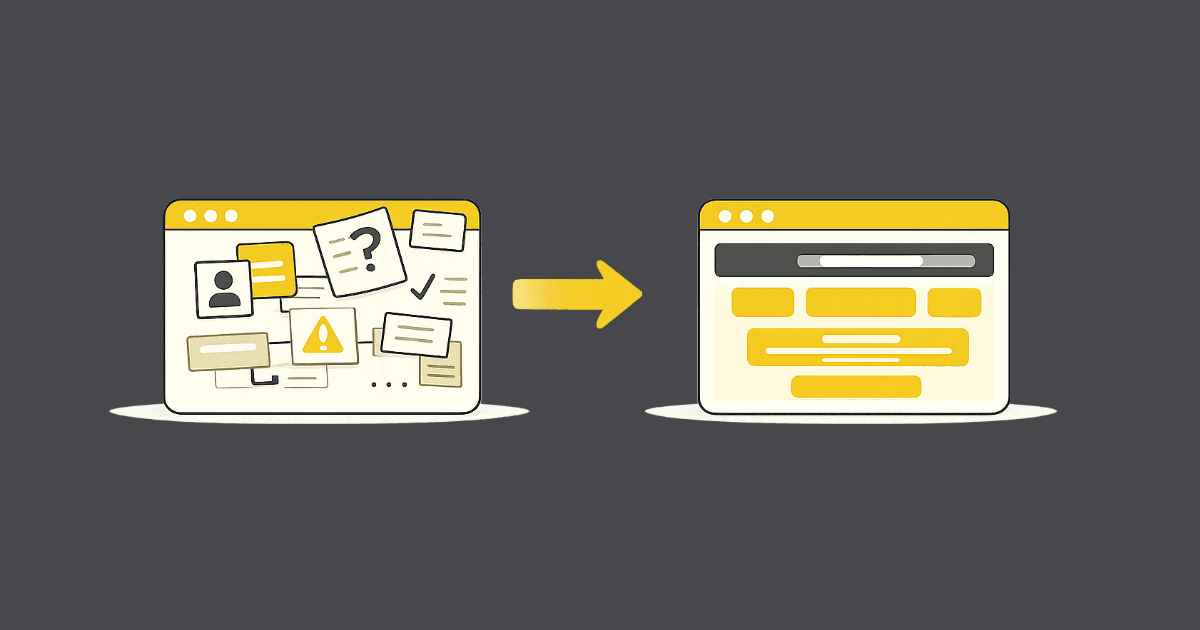
Why Your Small Business Website Isn’t Converting (And What to Fix First)

The 5 Essentials Every Small Business Website Needs in 2026
This Year, Let Your Website Do More of the Work
10 UX/UI Mistakes That Are Quietly Killing Your Website's Conversions

How to Build a Marketing Funnel That Turns Website Visitors Into Paying Clients

Branding 101: How Small Businesses Build a Premium Brand That Attracts Better Clients

How to Run Ad Campaigns That Actually Generate Leads (Not Just Clicks)
A creative studio specializing in web design, branding, and digital strategy. We help businesses build their online presence with impactful design and seamless execution.
" height="13.449209421163687px" id="RZy9ceYgH" width="13.415220533212192px"/></g></svg>)
" height="100px" id="ZGdWvzvid" transform="translate(0.11 0)" width="99.74727939993px"/></svg>)

" height="100px" id="hi4VD4pbv" transform="translate(0.11 0)" width="99.74230642343855px"/></svg>)
© 2026 ANG Productions. All Rights Reserved.
A creative studio specializing in web design, branding, and digital strategy. We help businesses build their online presence with impactful design and seamless execution.
ANG PRODUCTIONS
© 2026 ANG Productions. All Rights Reserved.
10 UX/UI Mistakes That Are Quietly Killing Your Website's Conversions
Great design should feel invisible
A website can look impressive and still fail at its actual job.
If visitors get confused, distracted, or unsure what to do next, even the most polished design will lose leads.
That is the difference between good visuals and good UX/UI.
Strong UX/UI is not about trends. It is about removing friction so people can find what they need and take action.
Here are the most common UX/UI mistakes we see on small business websites, and how to fix them.
What is UX/UI, really?
UX (user experience) is how a website feels to use. UI (user interface) is how it looks and functions. Together, they determine whether a visitor understands your business quickly or gives up and leaves.
Good UX/UI answers three questions almost instantly: What is this business? What can I do here? Why should I trust it?
1. Unclear navigation
If visitors cannot find your services, pricing, or contact page within a few seconds, they will assume your business is hard to work with.
Navigation should be simple, predictable, and consistent across every page.
Use clear labels like “Services” instead of vague ones like “Solutions”
Keep your main menu to 5–7 items
Make your contact or booking option easy to find on every page
2. Weak visual hierarchy
Visual hierarchy tells visitors what to look at first, second, and third.
When every element competes for attention, headlines, buttons, and images, nothing stands out and visitors do not know where to focus.
Fix this with size, spacing, and contrast. Your headline should be the boldest thing on the page. Your call-to-action button should be impossible to miss.
3. Slow load times
Speed is part of UX, not a separate technical detail.
A visitor who waits more than a few seconds for your site to load has usually already left.
Compress images, remove unnecessary animations, and keep your homepage lightweight. A fast site feels more trustworthy before a single word is read.
4. Too many calls to action
When a page offers five different next steps, book a call, download a guide, follow on social, join a newsletter, buy now, visitors freeze.
A confused visitor rarely takes action.
Every page should have one primary call to action. Everything else should be secondary, smaller, and out of the way.
5. Designing for desktop only
Most small business websites now receive the majority of their traffic from mobile devices.
If your buttons are hard to tap, your text is too small, or your layout breaks on a phone, you are losing leads before they ever reach your offer.
Mobile experience should be treated as the primary design, not an afterthought.
How to know if your website has a UX/UI problem
You may have a UX/UI issue if visitors leave quickly, your bounce rate is high, people say your site is “confusing” or “hard to navigate,” or your inquiries do not match your traffic.
These are not always design problems. Often, they are experience problems.
The takeaway
A beautiful website that is hard to use will still lose you leads.
Strong UX/UI does not need to be flashy. It needs to be clear, fast, and easy to follow.
Not sure where your website is losing people? Download our free Website Growth Checklist to review your key pages, messaging, and conversion points before your next update.
————
FAQs
What is the difference between UX and UI?
UX (user experience) is how a website feels to use, including navigation and flow. UI (user interface) is the visual design, including layout, color, and typography. Both work together to shape how visitors perceive and use your site.
How do I know if my website has bad UX?
Common signs include high bounce rates, visitors leaving quickly, confusion about navigation, and low conversion despite steady traffic. User behavior data and visitor feedback are the fastest ways to confirm the issue.
Does improving UX/UI actually increase leads?
Yes. Clearer navigation, stronger visual hierarchy, and simplified calls to action make it easier for visitors to understand your offer and take the next step, which directly improves conversion.
Is mobile UX really that important?
Yes. Most small business websites receive the majority of their traffic from mobile devices, so a site that is hard to use on a phone will lose leads regardless of how it looks on desktop.
Does ANG Productions help with UX/UI improvements?
Yes. ANG Productions helps businesses improve website structure, user flow, and design so visitors can navigate easily, trust the brand, and take action.
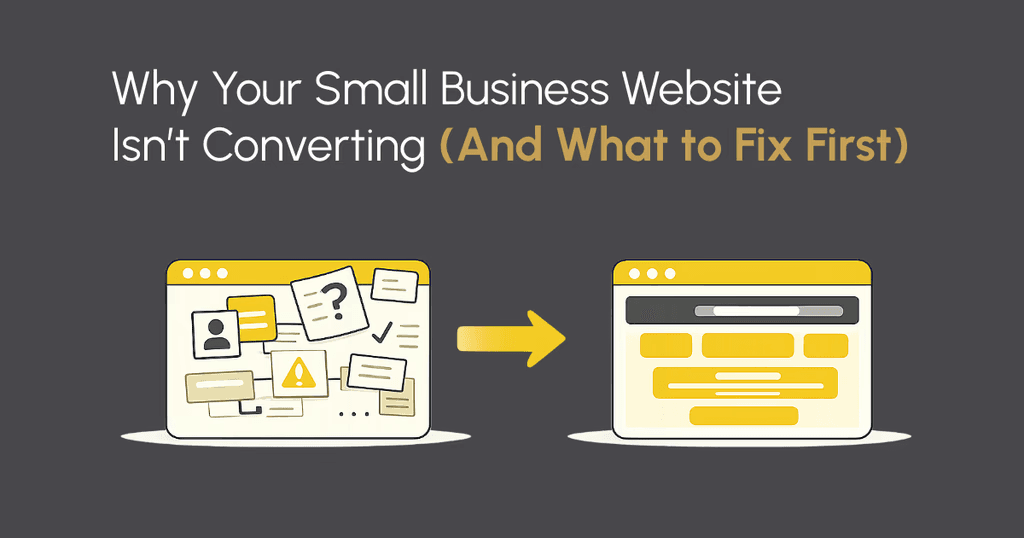
Why Your Small Business Website Isn’t Converting (And What to Fix First)
Why Your Small Business Website Isn’t Converting (And What to Fix First)
Why Your Small Business Website Isn’t Converting (And What to Fix First)
Why Your Small Business Website Isn’t Converting (And What to Fix First)
Related Articles
Read more from our blog
A creative studio specializing in web design, branding, and digital strategy. We help businesses build their online presence with impactful design and seamless execution.
ANG PRODUCTIONS
Services
© 2026 ANG Productions. All Rights Reserved.